UX News
A look at what's going on in the field of user experience.
10 Claude Code Tips & Tricks from Boris Cherny for Product Teams
, UX Planet - Medium
If you want to maximize your efficiency using any tool, you need to learn from the tool’s creator. Boris Cherny, creator of Claude Code…
taste.md
, UX Collective - Medium
the new tech buzzword
7 Rules for Creating an Effective Claude Code Skill
, UX Planet - Medium
Skills are files with instructions that Claude loads dynamically to improve performance on specialized tasks. Claude triggers skills…
Top 3 Claude Code + Figma Workflows
, UX Planet - Medium
“I burned a lot of tokens and achieved a mediocre result?” This is one of the common complaints that I hear from designers who recently…
Social media on trial
, UX Collective - Medium
How design was used to target vulnerable children
Credible vs. Confidence Intervals: Different Meanings but Similar Decisions
, MeasuringU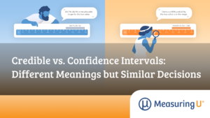
We’ve written a lot about confidence intervals for the last two decades.
We especially encourage them for small sample studies.
Cowork Mode in Claude Code for Product Design Tasks
, UX Planet - Medium
Claude Code for Desktop offers 3 separate modes for daily interaction: Chat, Cowork, and Code.
The old design workshop is dead. Long live design workshops.
, UX Collective - Medium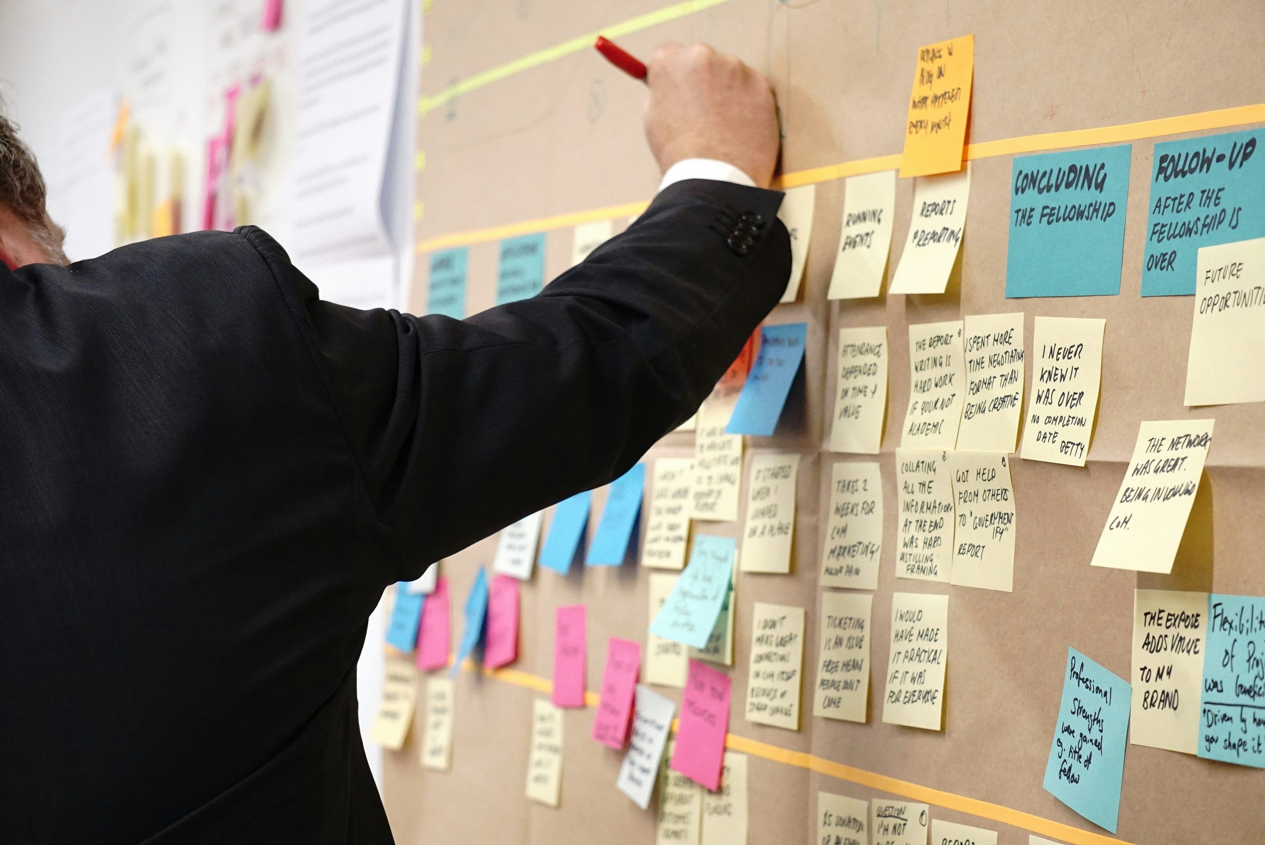
How new leaner design workshops are succeeding in 2026
Careful, liable UX is a thing now
, UX Collective - Medium
The recent ruling against Meta signals a shift that’s been brewing for a minute. Deceptive or dark patterns are no longer just…
Bayes’ Law in UX Research: The Power and Perils of Priors
, MeasuringU
“That confirms what I expected.”
The same data, two different conclusions.
