UX News
A look at what's going on in the field of user experience.
Claude Code sucks at UI design
, UX Planet - Medium
Here’s how to fix it in two simple steps
Design’s alive and kicking. It just got some flashy new names.
, UX Collective - Medium
Here’s which design roles are emerging in the age of AI.SourceThe tech community has been gripped by a collective anxiety. If you browse tech subreddits or check newsletters, the headlines paint a stark picture: AI is coming for white-collar jobs. Coding is dead. Design is obsolete.
Last month, AI pioneer Andrew Ng published a piece pushing back on this “jobpocalypse” narrative, arguing that AI is spinning up entirely new, highly specialized career paths. He focused on the engineering angle: roles like the AI Forward Deployed Engineer (who parachutes into client companies to customize agentic workflows) and the AI Engineer (who builds software using LLM components).
Designing for care, not growth
, UX Collective - Medium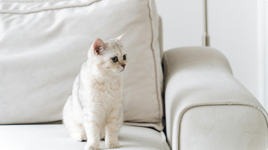
From healing fiction to smart feeders, the booming pet economy shows what design looks like when households shrink instead of grow.The modern companion of choice: self-contained, low-maintenance, and entirely at home in a small flat. Image sourceWalk into a bookshop in Britain or the US, and you will find a table, usually near the front, stacked with novels about cats. Not children’s books. Gentle, faintly magical stories for adults, in which a cat narrates, or saves a bookshop, or guides a lonely person back towards other people. The Travelling Cat Chronicles. The Cat Who Saved Books. We’ll Prescribe You a Cat. The covers are soft and pastel. The mood is unfailingly kind.
It’s not just a handful of curiosities any more. Translated Japanese fiction made up a quarter of the category’s UK sales in 2022, and within two years it accounted for 43% of the top forty translated titles. The cat on the cover has become such a reliable selling signal that, as one translator told the Guardian, publishers now reach for it whether or not there is actually a feline in the book. A good share of these titles lean on the same handful of motifs: a cat, a café, a bookshop, and a quietly unhappy person who is slowly mended by all three.
You’re not building a product. You’re running a project
, UX Collective - Medium
I said those words to a £30M bootstrapped CFO mid-interview.
The rhetorical mask of innovation
, UX Collective - Medium
How a single word lets us claim progress before we prove it1970s Reliant Robin | Image source: https://www.adrianflux.co.uk/cult-classics/reliant-robin/What is innovation? We hear this word used constantly, particularly in the creative, technology, healthcare, and education sectors. Companies advertise innovative products, hospitals implement innovative care models, and universities promote innovative programs — the word has become so ubiquitous that almost nobody stops to ask who benefits from that ubiquity.
According to Merriam-Webster, innovation is defined simply as a new idea, method, or device. On the surface, this definition seems reasonable, but the deeper implication is that it places all of its emphasis entirely on novelty. Which would suggest that if an artifact or a process is new, it can be labeled innovative regardless of whether it actually improves anything.
Creating AI-Ready Design System: Checklist
, UX Planet - Medium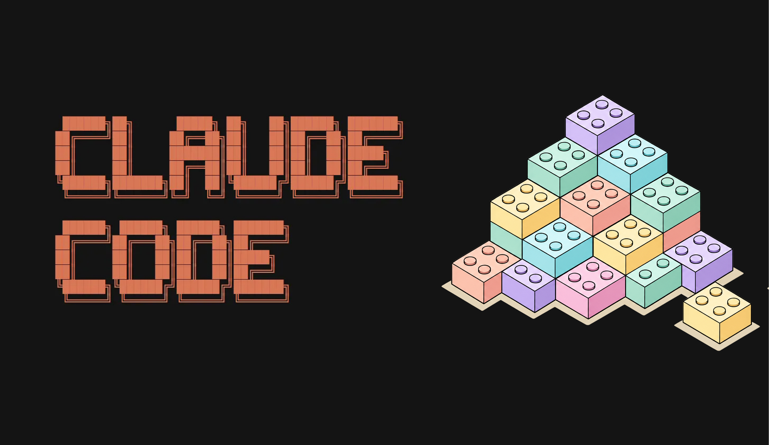
A 4-step process that will streamline your design process when you have a design system in place
Ultimate Claude Code Setup for Product Designers
, UX Planet - Medium
Most product designers don’t need Claude Code to write code.
Voice is the New UI
, UX Planet - Medium
For decades, we interacted with computers through graphical interfaces: buttons, menus, forms, and screens. This paradigm of interaction worked perfectly fine since the early 90s till the modern day.
Windows 95 interface: the concept of point and click was at the heart of interaction.AI is rapidly changing that.
Using the TAC-10 for Screening and Data Cleaning
, MeasuringU
It’s hard to collect data for UX research, and once you have it, you have to clean it.
In a simpler world, all respondents would be honest and focused on providing high-quality information rather than maximizing income, but that’s not the world we live in. From past research, we estimate the prevalence of cheating on paid panels to be about 10% of respondents (ranging from 3–20%).
Does AI Find Real UI Problems or Just Hallucinations?
, MeasuringU
In a previous experiment, AI identified roughly half the usability problems that trained researchers found in a video of a usability test session.
That sounds promising. If AI can find usability issues, it can substantially increase the amount of usability testing that research teams can conduct.
