[.text: alignment(center)]
Mobile and Multi-device Design
CMPT 363
“Mobile is not the future, it is the now. Meet your customers in the environment of their choice, not where it is convenient for you.”
— Cyndie Shaffstall
[.background-color: #618B25]
How to design for mobile and multi-device usage?
[.background-color: #FFFFFF]

[.background-color: #FFFFFF]
[.background-color: #618B25]
Topics to Explore
- “Mobile” Design
- Touch Interaction Design
- Responsive Web Design (RWD)
[.background-color: #611036] [.header: alignment(left),#FFFFFF]
Mobile and Multi-device Design
‘Mobile’ Design


[.background-color: #2d6e92] [class=activity-link-color] [.header: alignment(left),#FFFFFF] [.text: #FFFFFF]
Activity: Defining Mobile
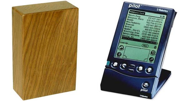
What does the term ‘Mobile’ mean in 2019?


False Mobile Assumptions
- Being mobile means being in a rush
- Mobile searches are mostly done on-the-go
- Mobile users are ok with having less
- Context is king (instead think about intent)
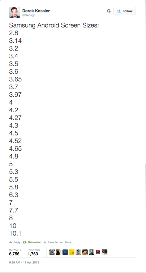
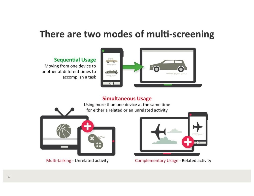
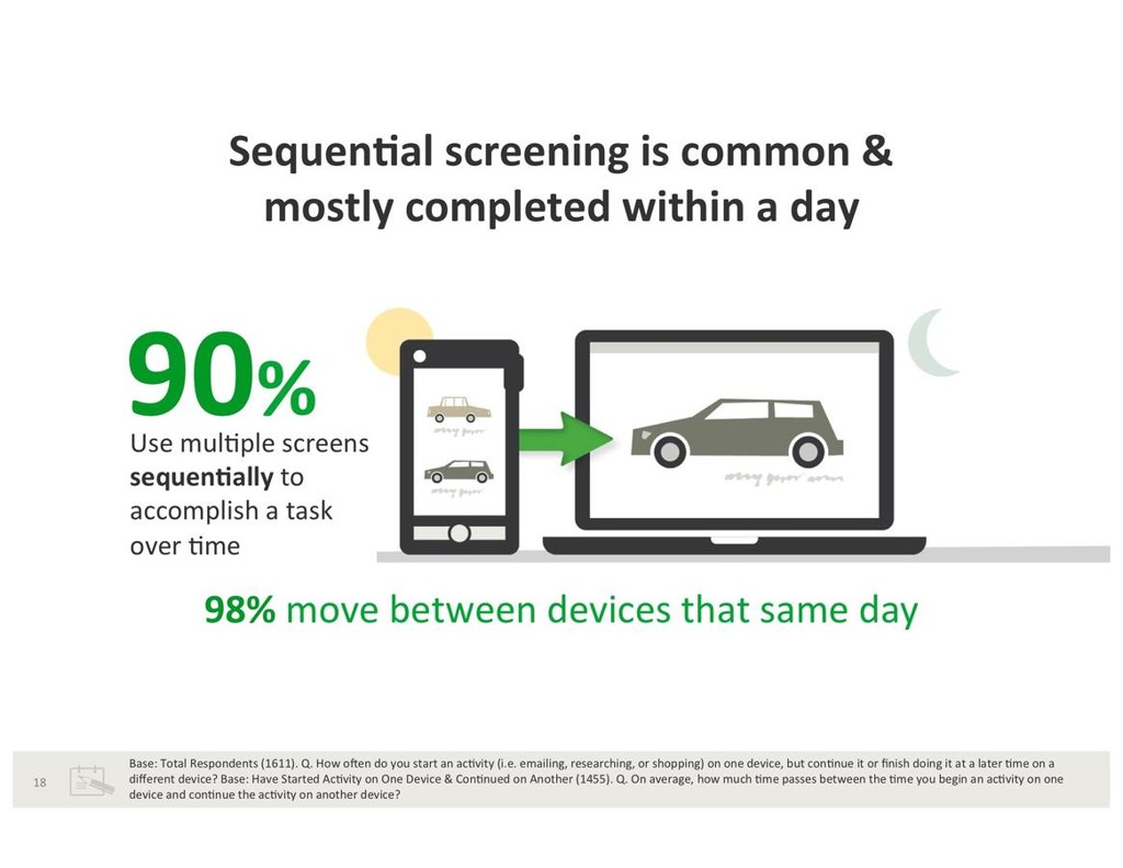
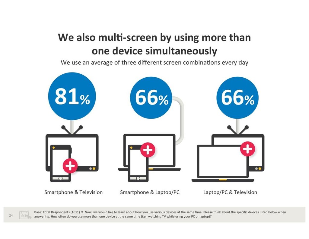
So, we need to think more about multi-device, and not just mobile
[.text: alignment(center),#FFFFFF]
Mobile First
- Mobile First, as defined by Luke Wroblewski in 2009
- Adoption (larger audience for mobile)
- Focus (content and functionality constraints)
- Technologies (touch, geolocation, etc.)


Mobile First, To Me
- When the element of mobility is a core value proposition
- Even given that, I prefer the battle cry of Experience First (HT @kevinmpowell) these days... why?
- Mobile usage (i.e. “on the go”) is context guessing at best
- No longer a singular mobile device, but a family of devices
- Since mobile to me is device independent – I define it as “being close at hand” or “being available”
- People deserve content/function parity everywhere
- The best experience should always be leveraged, not constrained, by device attributes
[.background-color: #FFFFFF]

[.background-color: #FFFFFF]

[.background-color: #FFFFFF]
[.background-color: #FFFFFF]
[.background-color: #FFFFFF]
[.background-color: #FFFFFF]
[.background-color: #545454]
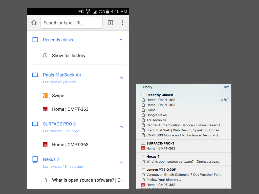
Multi-device Experience Goals
- Conceptual and visual consistency
- Content and functionality parity
- Seamless task transferability
- Think ecosystem, not isolated devices
- Optimize physical interactions on every device
Google Mobile Design Principles
- Home page and site navigation (1 of 5 categories)
- Keep calls to action front and center
- Keep menus short and sweet
- Make it easy to get back to the home page
- Don’t let promotions steal the show
developers.google.com/web/fundamentals/design-and-ux/principles/
iOS Mobile Design Principles
- Aesthetic Integrity
- Consistency
- Direct Manipulation
- Feedback
- Metaphors
- User Control
What is common between these two sets of mobile design principles?
Time for Questions & Discussion
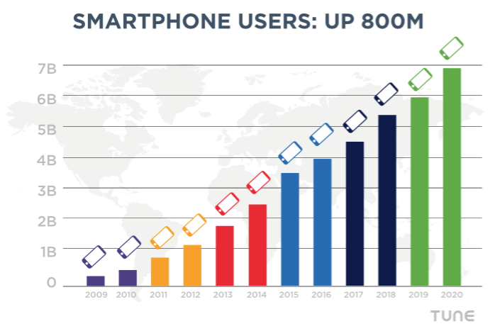
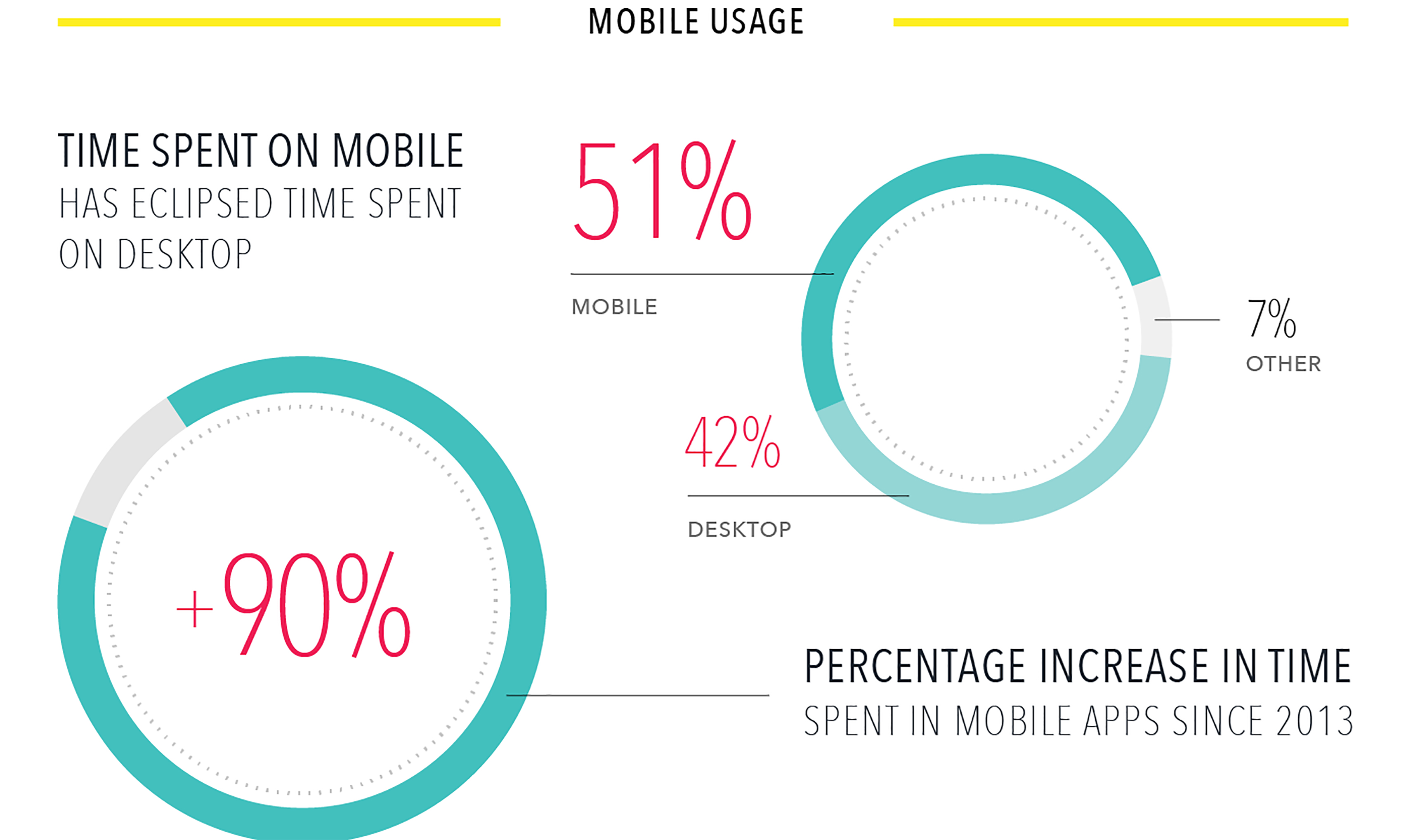
- What we’ve covered so far
- Mobile usage statistics
- Expect touchscreens everywhere
- Do not context guess with “mobile assumptions”
- Experience first vs. mobile first
- It is a multi-screen world
- Mobile design principles
- Coming up
- Touch interaction design
[.background-color: #611036]
Mobile and Multi-device Design
Touch Interaction Design

[.background-color: #FFFFFF]

[.background-color: #FFFFFF]
[.background-color: #FFFFFF]

[.background-color: #FFFFFF]
[.background-color: #2d6e92] [class=activity-link-color] [.header: alignment(left),#FFFFFF] [.text: #FFFFFF]
Activity: Small Screen Navigation Case Study
Let’s take a look at a website's level of 'thumb friendliness' on a mobile device...


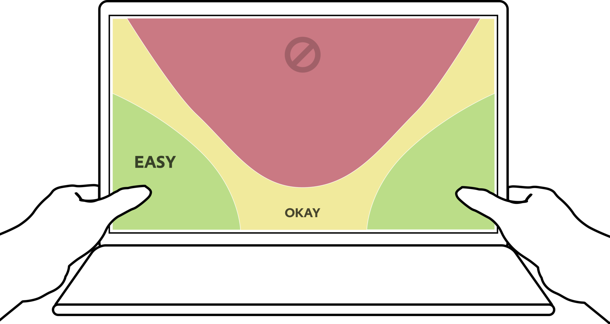
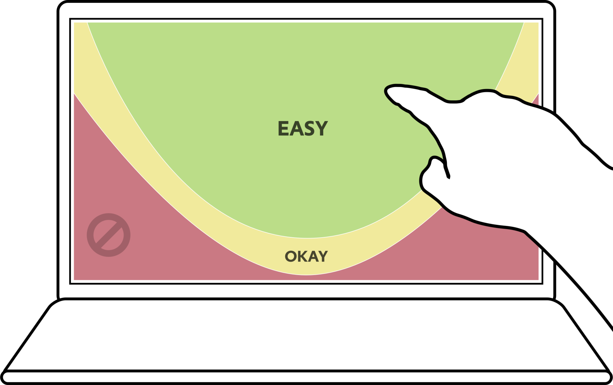
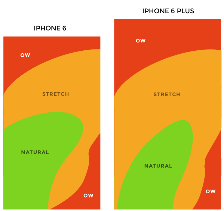
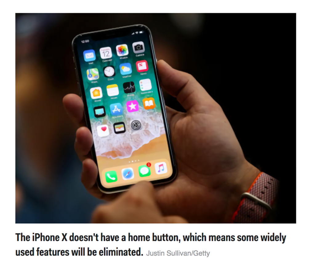
Essential Touch Interaction Design Guidelines
- Touch Target Size
- Placement of Controls
- Behavior (i.e. no hovers)
- User Effort
- Gestures (i.e. standard and non-standard)
Activity: Touch Interaction Analysis
[.background-color: #2d6e92] [class=activity-link-color] [.header: alignment(left),#FFFFFF] [.text: #FFFFFF]
PROJECT GROUP
One-Page Touch Interaction Design Checklist
Assess the touch interaction of your chosen open source/SFU community project mockups or prototype
[.background-color: #FFFFFF]

[.background-color: #FFFFFF]

[.background-color: #611036]
Mobile and Multi-device Design
Responsive Web Design (RWD)
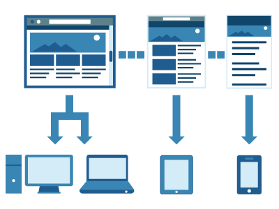
Responsive Web Design (RWD)
- Content/interface universal for all devices
- One source of content, presented differently
- Key elements
- CSS media queries
- Fluid grid layouts
- Flexible images and media

[.header: #FFFFFF, alignment(center)]
Responsive Web Design Sketch Sheets
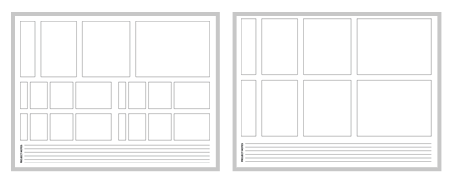
http://jeremypalford.com/arch-journal/responsive-web-design-sketch-sheets/
Intrinsic Web Design (a future successor to RWD?)
Use of Flexbox, Grid, and Box alignment for much more fine-grained control of placement
[data-background-iframe="https://www.helixeducation.com/resources/blog/move-responsive-web-design/"] [data-background-interactive]
Intrinsic Web Design
- Fluid & fixed
- Stages of squishiness
- Rows & columms
- Nested contexts
- Ways expand & contract
- Media queries,as needed
See the Pen Rate of change of size by Chen Hui Jing (@huijing) on CodePen.
Content Inventories
- A standard IA technique - even more essential for RWD
- Inventory a first step, but prioritization is the key
- Plays a key role when deciding upon RWD breakpoints
Typical Content Inventory Structure
- Content
- Type
- Location
- Meta-data
- Owner
- Last updated
- Comments
RWD Content Inventory Adjustments
- Content
- Priority
- Type
- Size (characters, image dpi/dimensions, etc.)
- Location
- Meta-data
- Content owner
- Last updated
- Comments
[.background-color: #2d6e92]
Activity: Content Inventory
PROJECT GROUP
Review your chosen open source/SFU community project and start to create a content inventory to estimate considered priority per placement
Content
Type
Size
Location
Indicated Priority
Prototyping Using a HTML Framework
- Generate smartphone, tablet, and desktop mockups
- Single source of content for all device presentations
- Supports a fast, highly iterative, design-feedback loop
- Focus first on creating the right thing, then focus on right look
- May be possible to seamlessly move from prototype to website
- Use a Responsive HTML Framework for Prototyping
Use a Responsive HTML Framework for Prototyping
- Twitter Bootstrap
- Zurb Foundation
- Material Design Lite (Google)
Twitter Bootstrap HTML Examples
Two Column Grid
<div class="row">
  <div class="span9">...</div>
  <div class="span3">...</div>
</div>
Information Alert Box
<div class="alert alert-info"> ... </div>Twitter Bootstrap Resources
- Twitter Bootstrap
- Pingendo - The ultimate Bootstrap 4 builder
- Twitter Bootstrap Tutorials
Caveat: Standalone HTML Prototypes May Hinder Collaborative Design
[.background-color: #618B25]
Summary
- “Mobile” Design
- Touch Interaction Design
- Responsive Web Design (RWD)
[.background-color: #888888]
References and Suggested Books
- Designing for Touch by Josh Clark
[.background-color: #888888]
Image Credits (for images without source URL or note)
http://uselog.blogspot.com/2005/10/user-centered-design-immerse-yourself.html
http://www.tune.com/blog/mobile-tipping-point-16-predictions-for-2016/
http://www.business2community.com/mobile-apps/dont-underestimate-importance-mobile-marketing-01422609#5ODb5qx2LhZqwjwD.97
https://www.stonetemple.com/mobile-vs-desktop-usage-study/
https://medium.com/swlh/browsers-not-apps-are-the-future-of-mobile-c552752ff75
https://twitter.com/derekakessler/status/322342508912852992
https://wearesocial.com/blog/2018/01/global-digital-report-2018
http://communities-dominate.blogs.com/
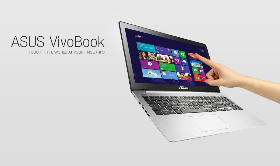
https://www.asus.com/sa-en/Laptops/asus_vivobook_s551lb/
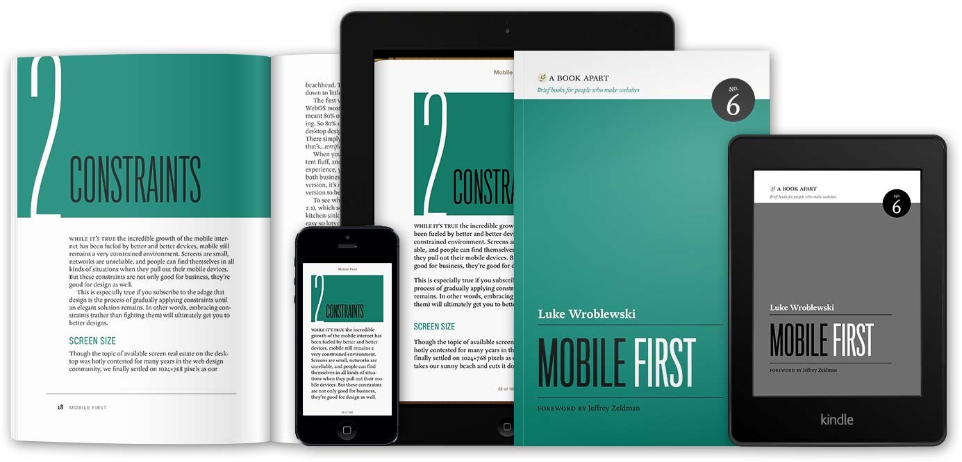
https://abookapart.com/products/mobile-first
http://bradfrost.com/blog/web/responsive-web-design-missing-the-point/
https://appsamurai.com/mobile-web-vs-mobile-in-app-advertising-which-is-better/
https://digitalstyle.com/blog/design/responsive-web-design-company/
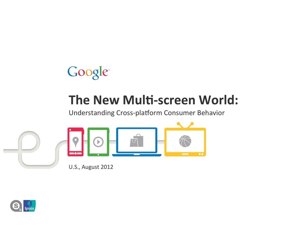
https://www.thinkwithgoogle.com/advertising-channels/mobile/the-new-multi-screen-world-study/
http://bgr.com/2013/06/17/samsung-galaxy-devices-chart/
https://www.gizmodo.com.au/2014/09/how-to-design-for-thumbs-in-the-era-of-huge-screens/
http://www.businessinsider.com/apple-iphone-x-reachability-2017-9
https://www.microsoft.com/en-ca/store/d/surface-pro/8nkt9wttrbjk/H3CS?ocid=AID695933_SEM_WbsABAAAAH4PT3wI%3a20180506144858%3as&activetab=pivot%3aoverviewtab
https://www.flickr.com/photos/maestroben/390454110/
https://bigmedium.com/ideas/desktop-touch-design.html
https://www.paulolyslager.com/responsive-design-hype-solution/
https://viljamis.com/2012/responsive-workflow/
https://justcreative.com/2018/06/26/intrinsic-web-design/