[.text: alignment(center)]
Visual Design Essentials
CMPT 363
“To design is much more than simply to assemble, to order, or even to edit; it is to add value and meaning, to illuminate, to simplify, to clarify, to modify, to dignify, to dramatize, to persuade, and perhaps even to amuse.”
— Paul Rand
[.background-color: #618B25]
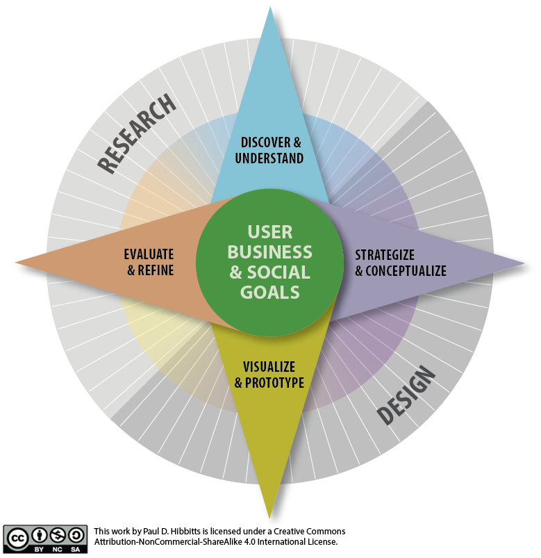
What are the essentials of effective visual communication?
[.background-color: #FFFFFF]
[.background-color: #618B25]
Topics to Explore
- Typography
- Grouping, Grids, and Visual Hierarchy
- Visual Design Principles
[.background-color: #FFFFFF]

[.background-color: #611036]
Visual Design Essentials
Typography
Typography
Typography is the design, selection, and placement of typefaces for communication
Typeface Classes
[.background-color: #FFFFFF]

What About Fonts?
A font is a specific rendering (i.e. size, weight, style, etc.) of a typeface. This is the same relationship as a song to a mp3 file.
[.background-color: #FFFFFF] [.header: alignment(center),#000000]
Typeface Selection

[.background-color: #FFFFFF] [.header: alignment(center),#000000]
Typeface Selection

[.background-color: #FFFFFF] [.header: alignment(center),#000000]
Typeface Selection

[.background-color: #FFFFFF] [.header: alignment(center),#000000]
Typeface Selection
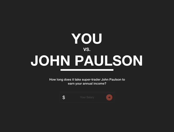
Selecting Typefaces
- Context (i.e. environment)
- Legibility (i.e. for individual characters)
- Readability (i.e. for blocks of text)
Tips about Selecting Typefaces
- Know common fonts for Mac and Windows
- Stick with classic combinations (check out fontsinuse.com)
- Limited palette (i.e. often only 2 different typefaces)
- Consider your planned visual hierarchy
[.background-color: #FFFFFF] [.header: alignment(center),#000000]
Typeface Anatomy

Type Measurement
72 points = 1 inch
6 picas = 1 inch
12 points = 1 pica
[.background-color: #FFFFFF] [.header: alignment(center),#000000]
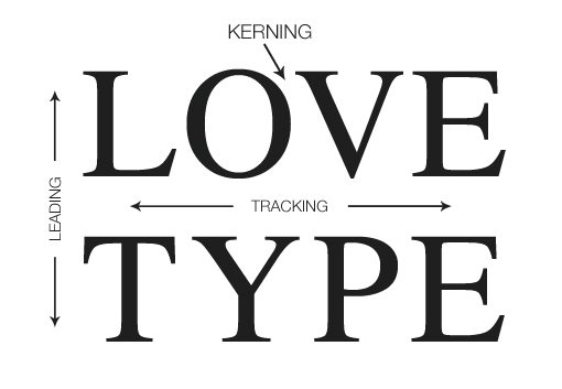
Kerning, Tracking, and Leading
[.background-color: #FFFFFF] [.header: alignment(center),#000000]
Leading: Before and After

[.background-color: #2d6e92] [class=activity-link-color]
Activity: Typography Analysis
Analyze the use of typography of (the responsively designed) microsoft.com and/or apple.com.
Consider the factors of typeface selections with regards to context (i.e. environment), legibility (i.e. for individual characters), and readability (i.e. for blocks of text).
Also be on the lookout for kerning (space between pairs of characters), tracking (spacing of multiple characters), and leading (spacing between lines).
Time for Questions & Discussion
- What we’ve covered so far
- Typeface classifications
- Typeface fonts
- Typeface selection
- Type anatomy
- Type measurement
- Kerning, tracking, and leading
- Coming up
- Grouping, grids, and visual hierarchy
[.background-color: #611036]
Visual Design Essentials
Grouping, Grids, and Visual Hierarchy
Grouping
Grouping similar or related elements on the screen can help viewers locate information most important to them.
Principles of Grouping (Gestalt Laws)
The Gestalt laws of grouping are a set of principles in cognitive psychology, which attempt to account describe how people tend to organize visual elements into groups.
Grids
By segmenting a screen using invisible grid lines you can more easily both organize and present content. While sometimes subtle, the use of grids can also help content appear more refined in nature.

[background-link="week-11/images/https___www.microsoft.comen-ca.png"]

[background-link="week-11/images/https___www.apple.comca.png"]
Visual Hierarchy
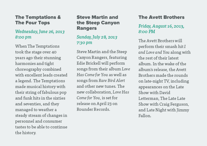
Visual hierarchy is the organization and prioritization of content in order to improve the communication of that content
Aspects of Visual Hierarchy
- Size
- Color
- Alignment
- Whitespace
[.background-color: #FFFFFF] [.header: alignment(center),#000000]
Typographic Hierarchy: Before

[.background-color: #FFFFFF] [.header: alignment(center),#000000]
Typographic Hierarchy: After
[.background-color: #2d6e92] [class=activity-link-color]
Activity: Grouping, Grids and Visual Hierarchy
PROJECT GROUP
Analyze the use of groups (Gestalt Laws), grids and visual hierarchy of your chosen open source/SFU community project
Gestalt Laws:
- Proximity
- Similarity
- Closure
- Continuity
Additionally, further explore and analyze microsoft.com and/or apple.com.
Time for More Questions & Discussion
- What we’ve covered so far
- Grouping
- Grids
- Visual hierarchy
- Coming up
- Visual design principles
[.background-color: #611036]
Visual Design Essentials
Visual Design Principles
Visual Design Principles
- Alignment
- Proximity
- Repetition
- Contrast
Alignment
Alignment refers to items on a page being lined up with each other
Effective Alignment
Primarily use only one type of alignment (e.g. left, right, centered) on a single page
[.background-color: #FFFFFF]

[background-link="week-11/images/https___www.apple.com_caapple-events.pn"]
Effective Alignment
While centered alignment easily provides visual balance, it is also less visually strong and can make multiple lines of text harder to read than other forms of alignment
[.background-color: #FFFFFF]

[background-link="week-11/images/https___www.apple.com_camac.png"]
[.background-color: #FFFFFF]

[background-link="week-11/images/https___azure.microsoft.comen-ca.png"]
Effective Alignment
Align horizontal elements, avoiding up/down/up/down situations, along an invisible baseline
[.background-color: #FFFFFF]

[background-link="week-11/images/https___www.microsoft.com_en-ca_windows.png"]
Proximity
Proximity refers to the relationships that can be communicated between items on a page, based on how close they are to each other
Effective Proximity
Place objects that have strong relationships with each other close to each other
[.background-color: #FFFFFF]

[background-link="week-11/images/https___support.apple.com_en-ca.png"]
Effective Proximity
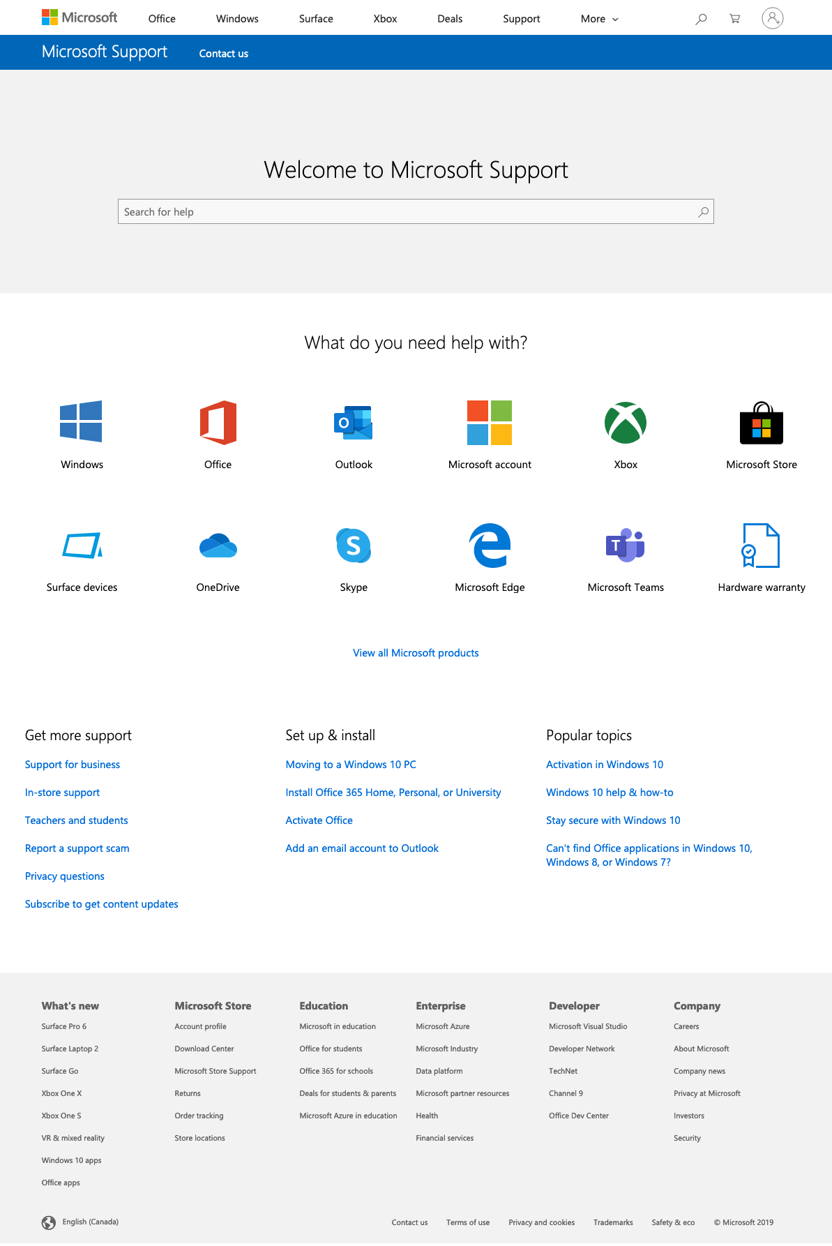
Perform a ‘squint test’ to help gauge proximity effectiveness by closing one eye, and then squinting the other eye until the page is out of focus
Be careful of too many visual groups, or equal spacing everywhere with the result of no visual focal point
[.background-color: #FFFFFF]

[background-link="week-11/https___support.apple.com_en-ca.png"]
[.background-color: #FFFFFF]
[background-link="week-11/images/https___support.microsoft.com_en-ca.png"]
Time for More Questions & Discussion
- What we’ve covered so far
- Alignment
- Proximity
- Coming up
- Repetition
Repetition
Repetition refers to the repeated use of particular design elements on a page, and also between pages
Effective Repetition
Reuse visual design elements (e.g. color, font, graphics, layout, etc.) to help communicate a sense of design unity
[.background-color: #FFFFFF]

[background-link="https://www.apple.com/ca/ipad/"]
[.background-color: #FFFFFF]

[background-link="week-11/images/https___www.apple.com_caiphone.png"]
[.background-color: #FFFFFF]

[background-link="week-11/images/https___www.apple.com_cawatch.png"]
[.background-color: #FFFFFF]

[background-link="week-11/images/https___www.apple.com_catv.png"]
Contrast
Contrast refers to how much visual difference there is between various items on a page
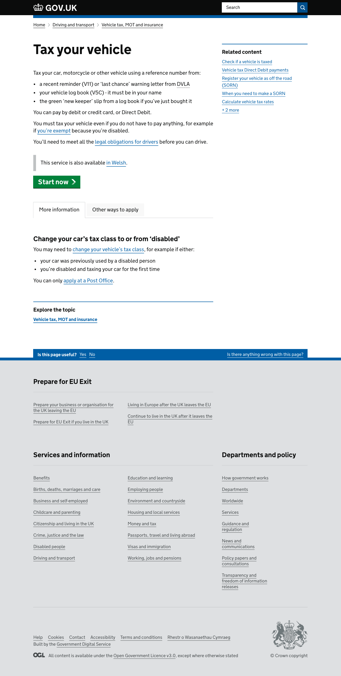
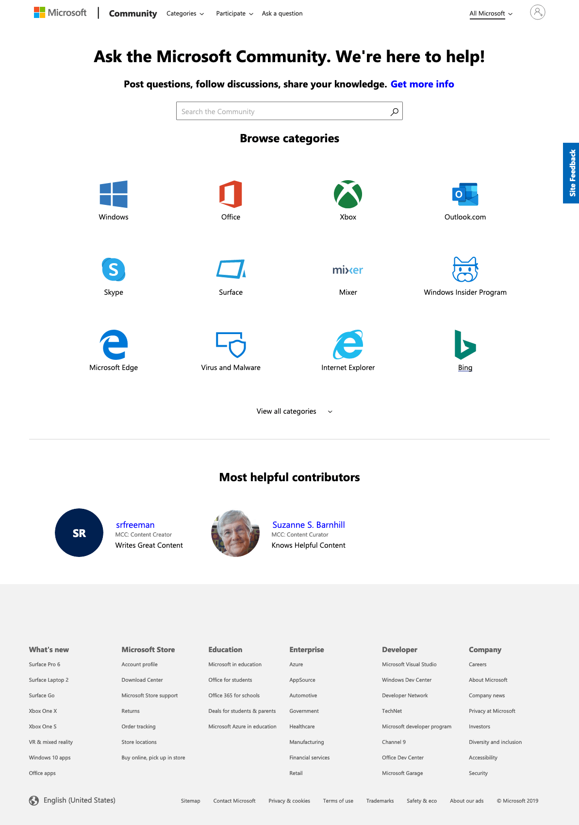
Effective Contrast
Use contrast to provide a visual hierarchy, and help guide the viewer’s eye around a page
[.background-color: #FFFFFF]
[background-link="week-11/images/https___www.gov.uk_vehicle-tax.png"]
[.background-color: #FFFFFF]
[background-link="week-11/images/https___answers.microsoft.com_en-us.png"]
Effective Contrast
If two items (fonts, graphics, etc.) are different then make them clearly visually distinct, otherwise make them identical
[.background-color: #FFFFFF]

[background-link="week-11/images/https___www.apple.com_ca_macbookspecs.png"]
Effective Contrast
Use contrast to bring focus to the most important elements of a page. Again, a ‘squint test’ can help gauge contrast effectiveness
[.background-color: #FFFFFF]

[background-link="week-11/images/https___www.apple.com_ca_macbookspecs.png"]
[.background-color: #FFFFFF]

[background-link="https://login.live.com/login.srf"]
Visual Design Principles
- Check alignment
- Group similar items together
- Create repetitive elements
- Use contrast appropriately (esp. visual hierarchy)
[.background-color: #2d6e92] [class=activity-link-color] [.header: alignment(left),#FFFFFF] [.text: #FFFFFF]
Activity: Visual Design Principles
PROJECT GROUP
Review your chosen open source/SFU community project in relation to the following:
- Alignment
- Proximity
- Repetition
- Contrast
[.background-color: #618B25]
Summary
- Typography
- Grouping, Grids, and Visual Hierarchy
- Visual Design Principles
- Alignment
- Proximity
- Repetition
- Contrast
[.background-color: #888888]
References and Suggested Books
- The Non-Designers Web Book by Robin Williams
- Visual Usability: Principles and Practices for Designing Digital Applications by Tania Schlatter
[.background-color: #888888] [.header: #FFFFFF, alignment(left)]
Image Credits
http://www.logodesignlove.com/next-logo-paul-rand
https://dwarfplanetpress.wordpress.com/2010/04/20/historical-classification-of-typefaces/
http://bonfx.com/bad-typography/
http://webdesignledger.com/21-inspiring-examples-of-typography-in-web-design/
https://dwarfplanetpress.wordpress.com/2010/04/20/historical-classification-of-typefaces/
http://bonfx.com/bad-typography/
http://webdesignledger.com/21-inspiring-examples-of-typography-in-web-design/
https://www.rockymountaintraining.com/basic-typography-terms/
https://designshack.net/articles/typography/8-simple-and-useful-tips-for-kerning-type/
https://webdesign.tutsplus.com/articles/understanding-typographic-hierarchy--webdesign-11636